ProgressCircle displays a circle that has a background color and is filled with another color. The fill level represents a progress between 0% and 100%. The circle has a hole in the middle (why didn't I call this progrject sk-progress-doughnut?) that can be used to display a short text (e.g. the current progress in percent).
The component is implemented as a Web Component using the awesome SkateJS project to normalize different browser behaviour and to include the polyfills required for some browsers.
Just include the compiled version and your're ready to use the web component.
<script src="node_modules/sk-progress-circle/dist/all.min.js">
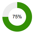
The most imporant attribute is status:
<sk-progress status="75"></sk-progress>
Attributes can be set in the HTML markup or the DOM node or during runtime.
backgroundColorColor to use for the background of the circle. Must be a valid color name or color value.
HTML: <sk-progress background-color="#a9a9a9"></sk-progress>
JavaScript: progress.backgroundColor = '#a9a9a9';
colorColor to use for the progress part of the circle
HTML: <sk-progress color="#339900"></sk-progress>
JavaScript: progress.color = '#339900';
labelText to be used inside the circle to diplay the current status. The %s will be replaced with the actual number
HTML: <sk-progress label="%s percent"></sk-progress>
JavaScript: progress.label = '%s percent';
labelColorText color of the label
HTML: <sk-progress label-color="darkgrey"></sk-progress>
JavaScript: progress.labelColor = 'darkgrey';
labelSizeFont-size of the label
HTML: <sk-progress label-size="24px"></sk-progress>
JavaScript: progress.labelSize = '24px';
sizeWidth and height of the ciricle in pixels
HTML: <sk-progress size="200"></sk-progress>
JavaScript: progress.size = 200;
statusProgress status from 0 to 100
HTML: <sk-progress status="33"></sk-progress>
JavaScript: progress.status = 33;
changeThe change event is emitted every time the value of status is changed.
Payload: status the current status of the component.